Anjella De Los Reyes
Digital Designer | UI/UX | Web & CRO | Front-End Development
A dashboard within a knowledge management system provides a centralized view of key metrics and insights, enabling users to track performance, manage content efficiently, and make data-driven decisions to enhance engagement and optimize strategies.
Project Overview
The Knowledge Base System I worked on aimed to enhance its user experience by introducing a dashboard feature. This new addition was designed to provide users with a centralized and visually intuitive overview of key metrics, performance indicators, and relevant data within the knowledge base. Ultimately, this feature was expected to ensure continuous improvement and deliver a seamless user experience for knowledge base administrators and contributors.
Role
As the UX Designer, I was responsible for conceptualizing, working on the UX of the dashboard. This involved conducting research, collaborating closely with stakeholders, and creating designs that addressed both user needs and technical constraints. I worked hand-in-hand with the product owner and development team throughout the project lifecycle, from ideation to final implementation.
Objective
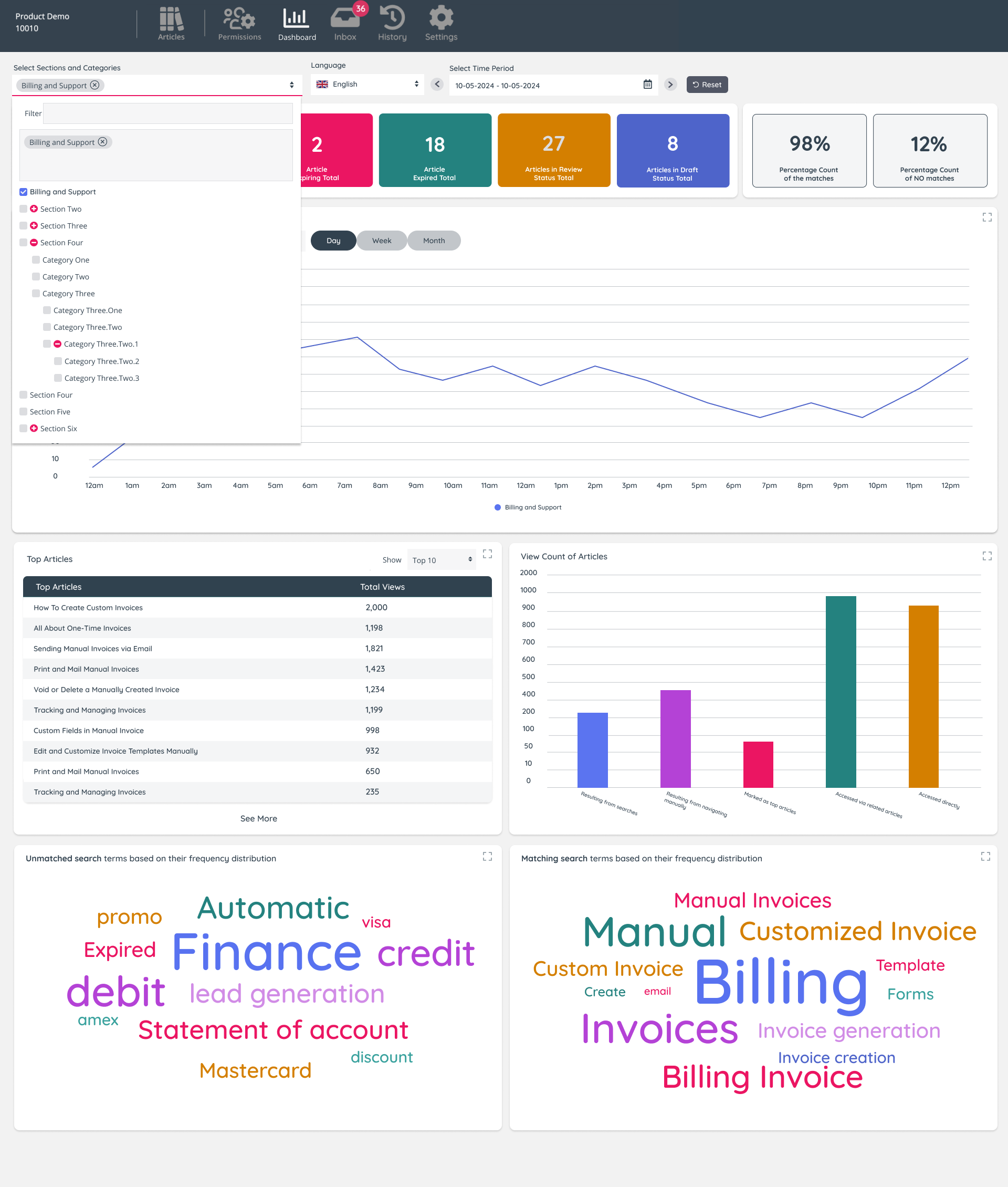
The primary objective of the project was to design a dashboard that presented actionable insights through an intuitive interface. It needed to accommodate diverse user needs, such as setting date ranges, filtering data by categories or languages, and displaying detailed metrics in various formats like charts, tiles, and lists. The ultimate aim was to create a tool that not only enhanced the overall knowledge base experience but also empowered users to make data-driven decisions efficiently.
Key Challenges and Solutions
One of the major challenges was designing a complex dashboard that users could understand and navigate at a glance. Low-fidelity wireframes became a critical tool during the ideation phase, allowing me to experiment with layouts and address usability concerns early. Time constraints posed another challenge, which meant skipping user interviews and relying on existing knowledge and quick iterations. Additionally, technical limitations required close collaboration with the product owner and developers to ensure the design was feasible and aligned with stakeholder requirements. Regular feedback loops allowed us to refine the design and address constraints effectively.

Research
I began by exploring how other systems managed dashboards and presented complex data visually. This research provided valuable insights into best practices for displaying metrics and designing interactive components. Additionally, I reviewed feedback from existing knowledge base users to identify pain points and prioritize features that would add the most value.
Ideation
The ideation phase centered on creating low-fidelity wireframes. These sketches focused on presenting key data, such as article counts, search results, and view metrics, in an organized and accessible manner. This stage was iterative, with frequent discussions with the product owner to ensure alignment with user needs and business goals. By testing various layouts and configurations, I was able to refine the structure and flow before moving to high-fidelity designs.
Design
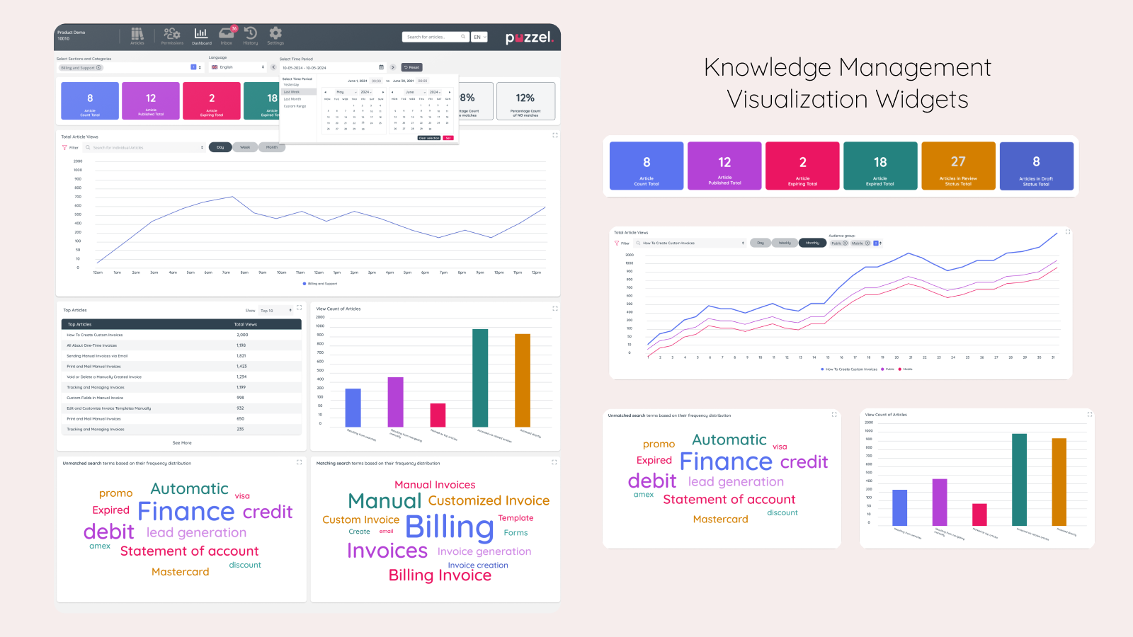
Once the wireframes were finalized, I transitioned to high-fidelity mockups. The visual design emphasized clarity and usability, incorporating elements like tiles for key metrics, line and bar charts for trends, and a top-20 articles list for granular insights. I also created a world cloud visualization to highlight popular search terms dynamically. The design adhered to a consistent style guide to ensure a cohesive look and feel across the platform. Creating the style guide was crucial in maintaining visual consistency and simplifying the handoff to developers.
Testing
Although formal usability testing was limited due to time constraints, I conducted informal reviews with the product team and internal stakeholders. These sessions provided valuable feedback, which I incorporated into the final design. Refinement sessions with the development team also helped ensure the feasibility of the proposed solutions and clarified any ambiguities in the design.
Outcome (Result)
The final dashboard design successfully met all acceptance criteria, offering users the ability to filter data by date ranges, categories, and languages. Key metrics were presented in a combination of tiles, charts, and lists, providing a comprehensive and actionable overview. The inclusion of visualizations like bar charts and line graphs enhanced the user’s ability to track trends and make informed decisions. The project was well-received by stakeholders, and the dashboard became a valuable tool for improving content strategies and user engagement within the knowledge base. By focusing on user needs and maintaining close collaboration throughout the project, I delivered a solution that balanced functionality, usability, and aesthetic appeal.
