Anjella De Los Reyes
Digital Designer | UI/UX | Web & CRO | Front-End Development
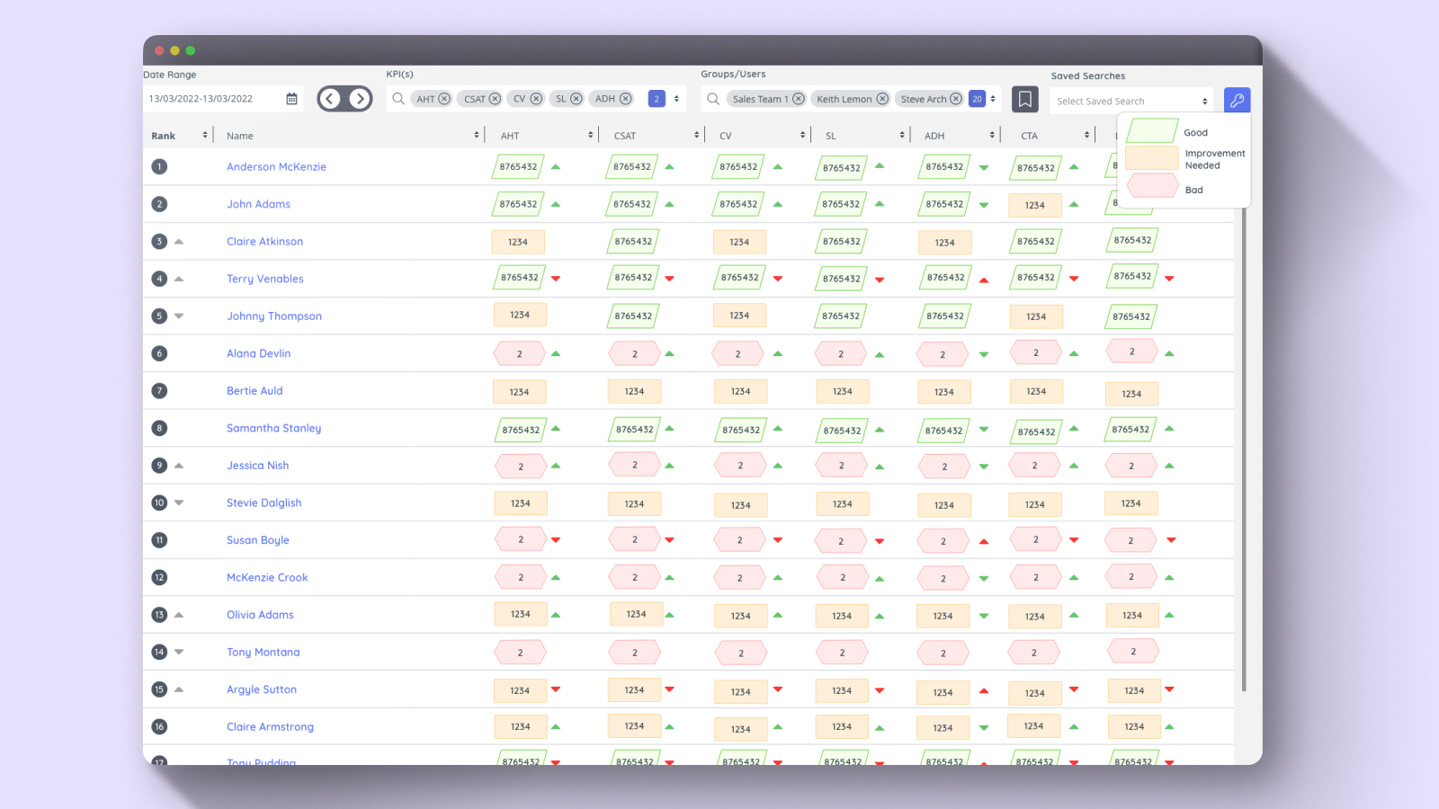
The Challenge
As a UX designer, I was tasked with improving the accessibility of a data table that categorized values into three levels: Low (Red), Medium (Orange), and High (Green). While this worked well for most users, it posed a significant challenge for color-blind individuals who struggle to differentiate these colors. My goal was to ensure that all users, regardless of their visual abilities, could quickly and easily interpret the data.
The Solution
To address this, I implemented an Accessibility Toggle that allows users to switch to a color-blind-friendly mode. In this mode, I introduced distinct background shapes in addition to colors:
✔ Low values (formerly red) – Displayed with a custom shape with red background
✔ Medium values (formerly orange) – Displayed with a custom shape with yellow background
✔ High values (formerly green) – Displayed with a custom shape with green background
Additionally, I included a legend (key) that clearly explains the corresponding values for both color and shape, ensuring users can easily understand the information at a glance.
This is the color blind friendly table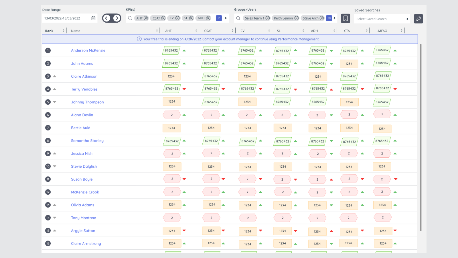
The Impact
With this enhancement, users with color blindness no longer have to rely solely on color to interpret the data. The combination of color, shape, and a clear key ensures that the table is accessible, intuitive, and efficient for everyone.
Takeaways
This project reinforced the importance of designing with inclusivity in mind. Accessibility is not just an afterthought—it’s a fundamental part of UX design that makes digital experiences better for all users.