Anjella De Los Reyes
Digital Designer | UI/UX | Web & CRO | Front-End Development
A survey tool in a contact center lets businesses gather real-time customer feedback, providing insights into satisfaction, service quality, and improvement areas. This feedback helps track performance, identify customer trends, and drive data-based improvements to enhance customer experience and service responsiveness.
How can I help users to create survey and gather feedback in the admin interface?
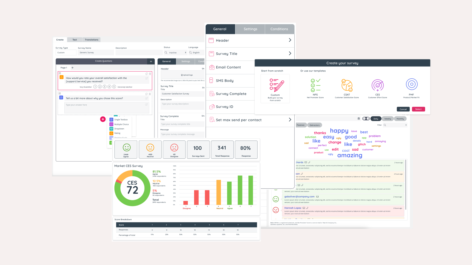
The survey creation interface should be designed to feel intuitive and user-friendly, ensuring that users can navigate it easily without requiring prior knowledge or extensive training. Ideally, it presents a streamlined layout with clear, self-explanatory options, such as pre-set templates (Ex: NPS, CSAT) to help users get started effortlessly.
Each step in the process—adding questions, selecting response types, and customizing design elements—should flow naturally, guiding users forward without creating a need to backtrack.
Additionally, real-time feedback and preview options are essential; they allow users to instantly see how their survey will look as they build it, making adjustments as needed. With built-in hints and prompts, the interface can further reduce potential errors, creating an efficient and enjoyable experience.
Overall, a truly intuitive survey creation interface feels responsive and anticipates user needs, minimizing cognitive load and empowering users to complete their tasks confidently and efficiently.
Project Overview
Project Title: Survey Designer
My Role: User Experience (UX) Designer, UI Designer
My role as the UX Designer was to create a survey designer from scratch, collaborating closely with multi-functional team to deliver a solution that enhances customer insights in a user-friendly way.
Objective
To create a survey tool that enables contact centers to seamlessly set up, collect, and analyze customer feedback through intuitive surveys. Create an accessible and visually cohesive survey tool that meets WCAG standard.
Research
To ensure our tool would stand out, I explored various survey tools (SurveyMonkey, Google Forms,Typeform,Zoho Survey) to understand industry standards, strengths, and gaps. Through this research, I identified features and user experiences that contact centers find most effective.
| Feature/Aspect | SurveyMonkey | Google Forms | Typeform | Zoho Survey |
|---|---|---|---|---|
| Ease of Use | Intuitive interface, suitable for all levels. | Extremely easy to use, minimal learning curve. | Interactive design, visually engaging. | Easy to navigate with detailed setup options. |
| Survey Types | Advanced surveys with skip logic, A/B testing, and templates. | Basic surveys with limited customization. | Conversational-style surveys. | Standard and customizable surveys with branching. |
| Design & Customization | Basic themes, limited visual customization. | Minimal design options. | Highly customizable, modern aesthetics. | Moderate customization with branding support. |
| Features | Advanced analytics, question logic, audience targeting. | Basic analytics, real-time responses, and sharing. | Unique interactive format, conditional logic, multimedia embedding. | Multilingual support, analytics, real-time collaboration. |
| Analytics | Advanced reporting tools with export options. | Simple summary charts and tables. | Insightful, visually appealing reports. | Detailed reporting with filters and sharing options. |
| Strengths | Robust features for professional use. | Free and user-friendly. | Highly engaging survey experience. | Affordable with good feature depth. |
| Weaknesses | Expensive for small-scale users. | Lacks advanced features. | Costly for advanced use. | Limited brand recognition outside Zoho users. |
Research Takeaways
- Users need an intuitive setup for quick survey creation.
- Real-time insights and accessibility are critical to our audience.
- Consistency and ease of navigation should be prioritized.
Ideation: Bringing Ideas to Life
Conceptualizing the Experience
I translated our goals into tangible ideas through brainstorming sessions. The key question: How can we make setting up and analyzing surveys feel effortless? I sketched various layouts and survey flow designs that kept the experience streamlined and accessible.
Wireframes
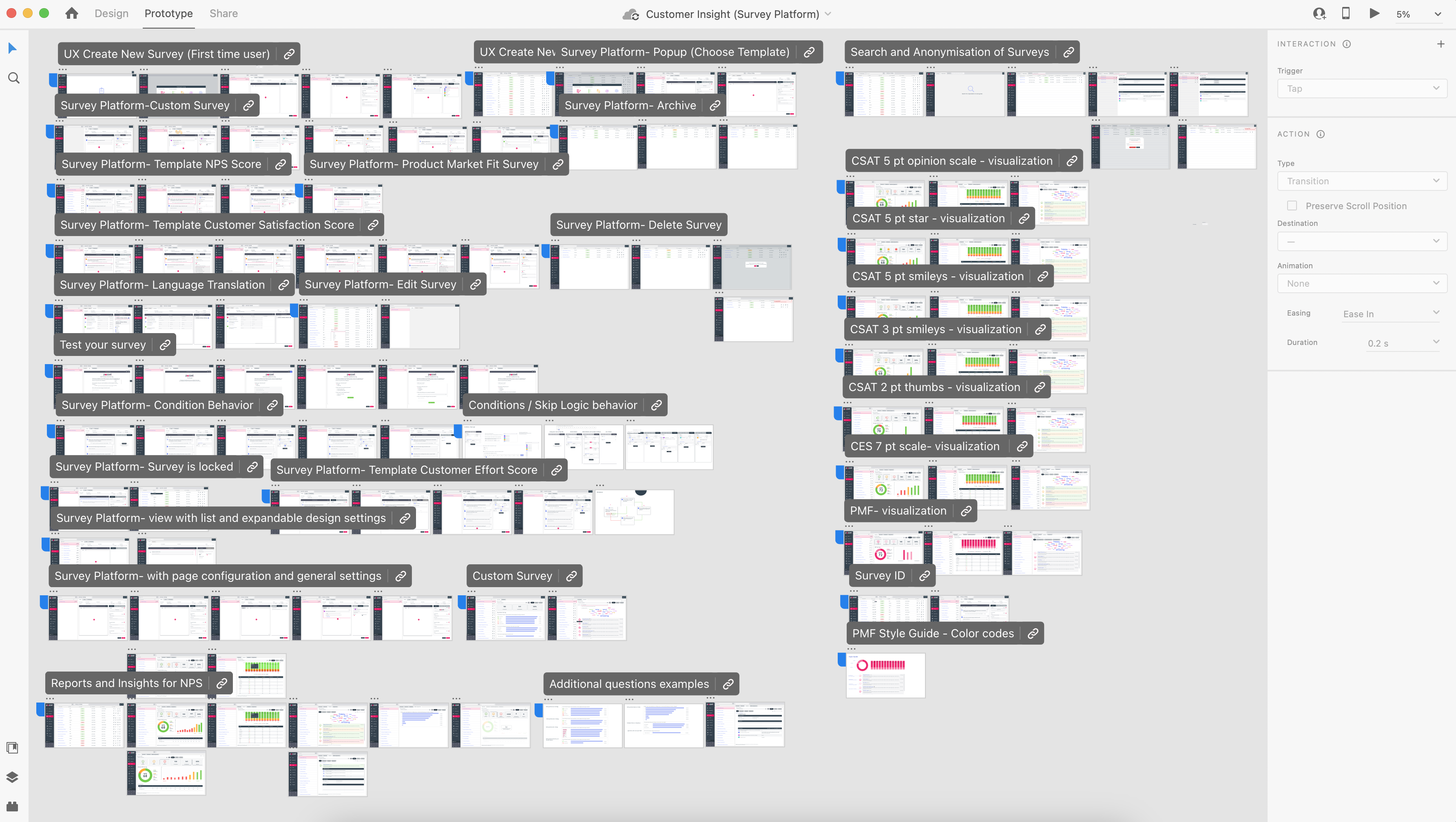
From my sketches, I developed detailed high-fidelity mockups to visualize and create the user experience (UX) design of creating custom survey, configuration of survey, selecting a survey template, how to preview a survey, Conditional logic(rules), language translation and dashboard. These mockups served as blueprints, guiding discussions with the Product Owner and Development Team.
I worked closely with the Product Owner to gather requirements and align on the visions. I also work with my UX manager and have a bi-weekly design critique meeting to make sure our designs (from different product) are aligned and consistent.

Prototyping: Refining the Design
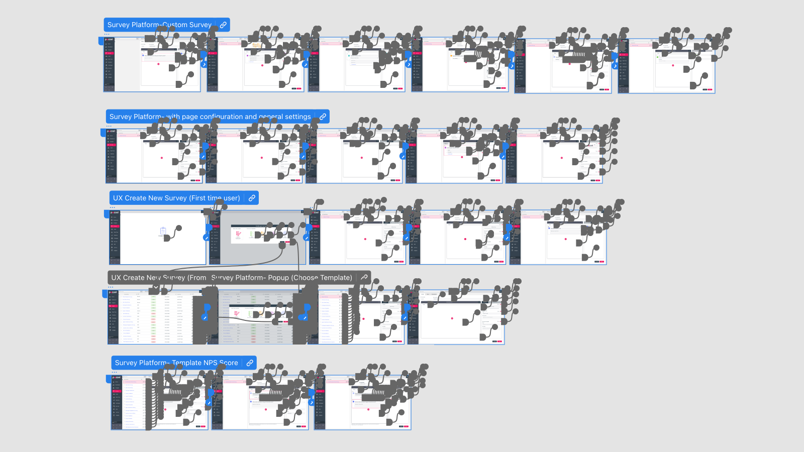
I created interactive prototypes to bring the experience to life, to present to the stakeholder and developers to see the flow. During our refinement meetings, We iterated on designs based on feedback. This collaborative approach ensured alignment and tackled any technical constraints early, optimizing both design and functionality.
Testing
Although formal usability testing wasn’t conducted due to time constrained and lack of resources, I shared prototypes during our meetings. These sessions enabled me to collect real-time feedback and refine the design to address usability concerns. The prototypes effectively illustrated the system’s functionality, ensuring alignment with stakeholder expectations and user needs.
Final Design & Style Guide: Ensuring Consistency
After final feedback, the approved design was handed off to development. I created a style guide to guarantee consistency and compliance with accessibility standards (WCAG), covering elements like colors, typography, buttons, and iconography.
Key Features of the Final Design
- User-Friendly Interface: Streamlined survey creation with a clear, step-by-step setup.
- Accessible Design: All components meet WCAG accessibility requirements, ensuring usability for a diverse range of users.
- Consistent Style: The style guide provides a visual standard for future updates, ensuring brand consistency across product

Outcome
The Survey designer tool now empowers the business to collect and analyze feedback effortlessly, driving data-driven decisions that improve customer experience. It has received positive feedback from both internal stakeholders and end users, who appreciate the tool’s intuitive layout and streamlined design. This project reinforced the importance of close collaboration with cross-functional teams and stakeholders. Aligning on requirements from the start and refining through feedback helped deliver a solution that is both user-centered and technically feasible. Additionally, creating a robust style guide was essential to maintaining consistency as the tool evolves.

