Anjella De Los Reyes
Digital Designer | UI/UX | Web & CRO | Front-End Development
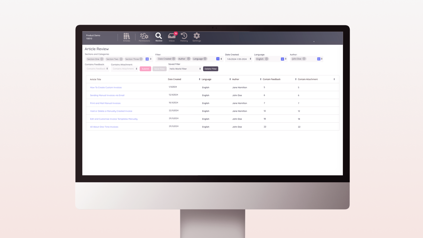
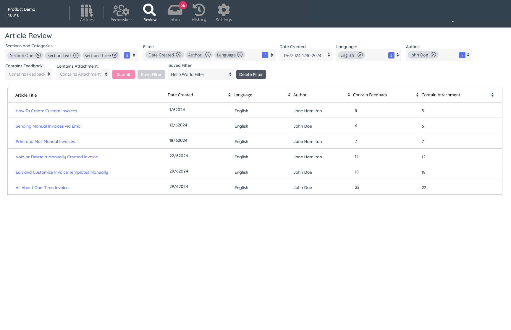
Knowledge Management System - Article Review
Project Overview
The Knowledge Base system need an upgrade—and to introduce an Article Review System to empower authors and managers to streamline content maintenance. This feature aimed to make it easy to identify outdated articles and filter content efficiently using multiple metrics like section, category, date, language, authorship, feedback presence, and attachments. It also allowed users to save their preferred filters for seamless future use, aligning with the broader goal of enhancing the Knowledge Base’s usability.
Role
As the UX Designer, my role was to transform the clear requirements from the product owner into a functional and visually cohesive solution. This involved translating complex user needs into intuitive design flows and ensuring developers had a style guide to maintain consistency throughout the implementation.
Objective
The objective was clear: to create a robust review system that seamlessly integrated into the existing Knowledge Base, minimizing complexity for users while maximizing efficiency in content review and organization.
Key Challenges and Solutions
Although time constraints prevented formal user interviews, I drew on prior knowledge from past user interactions and feedback regarding the Knowledge Base. My experience in revamping features for the system, including the Knowledge Base’s foundational structure, provided me with a strong understanding of user pain points and expectations.
Ideation
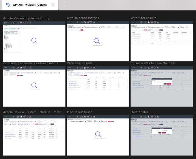
This was one of my smoothest UX design that i did in the Knowledge Base domain. The requirements were clearly outlined from the start, eliminating ambiguity. I skipped the low-fidelity mockup phase and user interviews. Instead, I leveraged my deep understanding of the system and the target users to go directly into high-fidelity design. While this approach deviated from the typical design process, it saved time without compromising quality.
To ensure alignment, I worked closely with the product owner and with developers during refinement sessions, presenting the high-fidelity mockups and gathering their input to address potential technical constraints. This collaborative approach was crucial in maintaining the design’s feasibility and functionality.
I aimed to keep the interface intuitive, ensuring users could quickly grasp how to apply and save filters. I refined these ideas into actionable flows that matched the defined objectives.
Design
The design process began directly with high-fidelity mockups. These were crafted to integrate seamlessly with the existing Knowledge Base interface, adhering to established brand guidelines. I emphasized creating a clear, consistent layout that highlighted the filtering and review options without overwhelming users. To further ensure a cohesive design language, I developed a comprehensive style guide detailing typography, spacing, colors, and component behaviors. This document not only supported the Article Review System but also served as a reference for future Knowledge Base updates.
Testing
Refinement sessions served as informal testing grounds. Developers provided valuable feedback, helping to identify areas where the design could be optimized for technical implementation. These iterative discussions allowed us to fine-tune the design before final approval.
Outcome
The Article Review System was successfully implemented and integrated into the Knowledge Base. The new feature streamlined the review process, allowing authors and managers to maintain content more effectively. Feedback from initial users highlighted the simplicity and effectiveness of the filtering options and the time saved by using saved filters. The style guide further ensured a polished and consistent user experience across the system, solidifying the foundation for future enhancements.
This project demonstrated the value of clear communication, alignment, and flexibility in the UX process. While the absence of user interviews posed a challenge, leveraging existing knowledge and focusing on collaborative design ensured the final outcome met user needs and exceeded expectations.