Anjella De Los Reyes
Digital Designer | UI/UX | Web & CRO | Front-End Development
How did I turn data into insights and help supervisors to visualize real-time reports and create customized visualization widgets in the contact center admin interface?
Creating a Supervisor Dashboard will help supervisors to customize widgets to display real-time data within the Contact Center Admin Interface. It also provides historical statistics reports, typically covering data from the previous day or up to the current time today, allowing supervisors to gain valuable insights into performance and trends.
Project Overview
Project Title: Supervisor Dashboard
My Role: User Experience (UX) Designer, UI Designer
Overview
To showcase the design of a dashboard management tool within the admin interface that enables agents to create custom widgets for tracking key metrics—such as historical reports, queue status, traffic, and agent availability.
This case study will highlight how the design prioritizes ease of use, flexibility, and visibility of key performance indicators (KPIs), providing agents with insights that support informed decision-making and efficient management of contact center operations.
Objective
With real-time access to essential performance indicators—such as wait times, abandonment rates, current call queues, and agent statuses—managers and supervisors can stay fully in tune with their teams through a single, comprehensive view. These insights empower them to make quick, data-driven decisions using a customizable live dashboard.
The real-time monitoring alerts managers and supervisors to items requiring immediate attention, enabling responsive, informed decision-making as situations unfold. Agents also benefit from assistive feedback during critical moments, ensuring they consistently deliver the high standard of service that customers expect.
Key features include:
– Real-time event display
– Contact monitoring
– Configurable metrics with widgets
-Customized visualization widgets
-Private and company view dashboard
Key challenges and solutions
One of the key challenges I encountered was building a dashboard for visualizing metrics within the Admin Interface from scratch, as we lacked an existing tool. Initially, my colleague started the project with user interview and created a draft wireframe of how visualization widgets will look like, The project has been transferred to me to develop it further to meet specific requirements such as how to create visualization widgets and customize it (with step by step guide) and I conducted in-depth research on dashboard design best practices and explored various visualization methods that would suit the diverse data sets. I also had an opportunity to take an online course in Interactive Foundation Design to help me create the intuitive dashboard design.

Research
When this projects has been transfered to me, the first phase on my end involved a thorough competitor analysis to understand how other dashboard management in the industry approach data visualization, widget creation, and user interaction. By examining these competitive solutions, I identified best practices and potential gaps, which provided a solid foundation for creating a unique and effective design tailored to our users’ needs.
Ideation
Next, I moved into the ideation phase with brainstorming sessions to generate various ideas for the dashboard interface. This stage included sketching early concepts and exploring multiple layouts and widget structures. From these sketches, I started concept creation by refining ideas that aligned best with both user needs and project requirements, keeping the focus on flexibility, ease of use, and quick access to data. I closely collaborated with the product owner and development team to ensure the dashboard aligned with user and business needs, making iterative adjustments based on feedback to enhance usability and clarity. This approach allowed us to tailor the dashboard for optimal functionality, delivering a comprehensive, user-friendly tool for metric visualization within the Admin Interface.
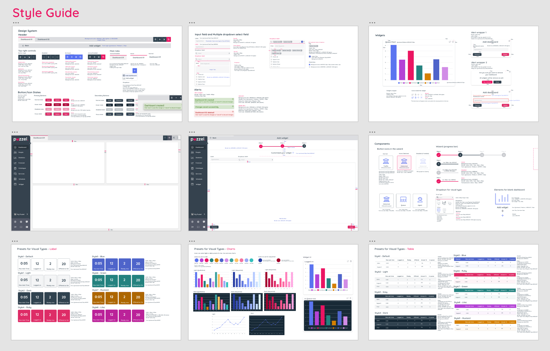
Design
With a clear concept, I began the design phase, creating wireframes to outline the basic structure and functionality of the dashboard. After gathering feedback on these wireframes, I moved to mockups and prototyping, where I incorporated styling, interactions, and more detailed user flows. This allowed for a closer-to-final visualization of how agents would interact with the dashboard and create widgets for visualizing critical metrics.

Testing
Once the initial product iteration was delivered by the Dev team, It was rolled out to the broader team for further testing. This allowed us to gather valuable feedback from colleagues and clients familiar with the platform, enhancing our understanding of both usability and functionality through their insights. This testing provided valuable insights into what worked well and what could be improved. I also checked the UI if it is consistent and create a snagging list.
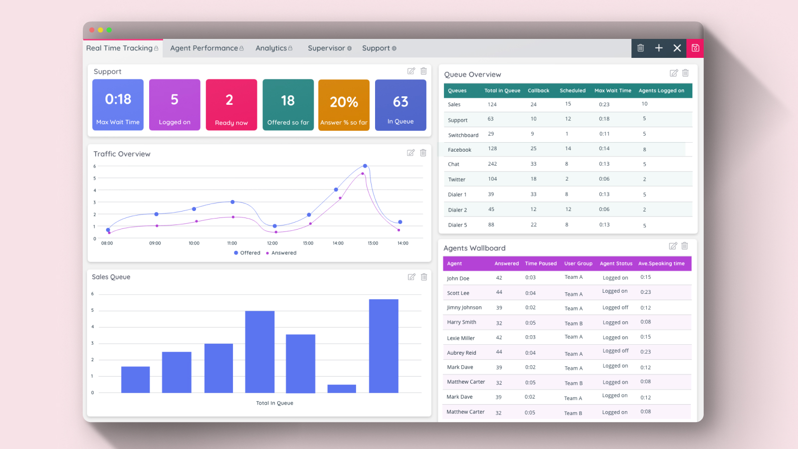
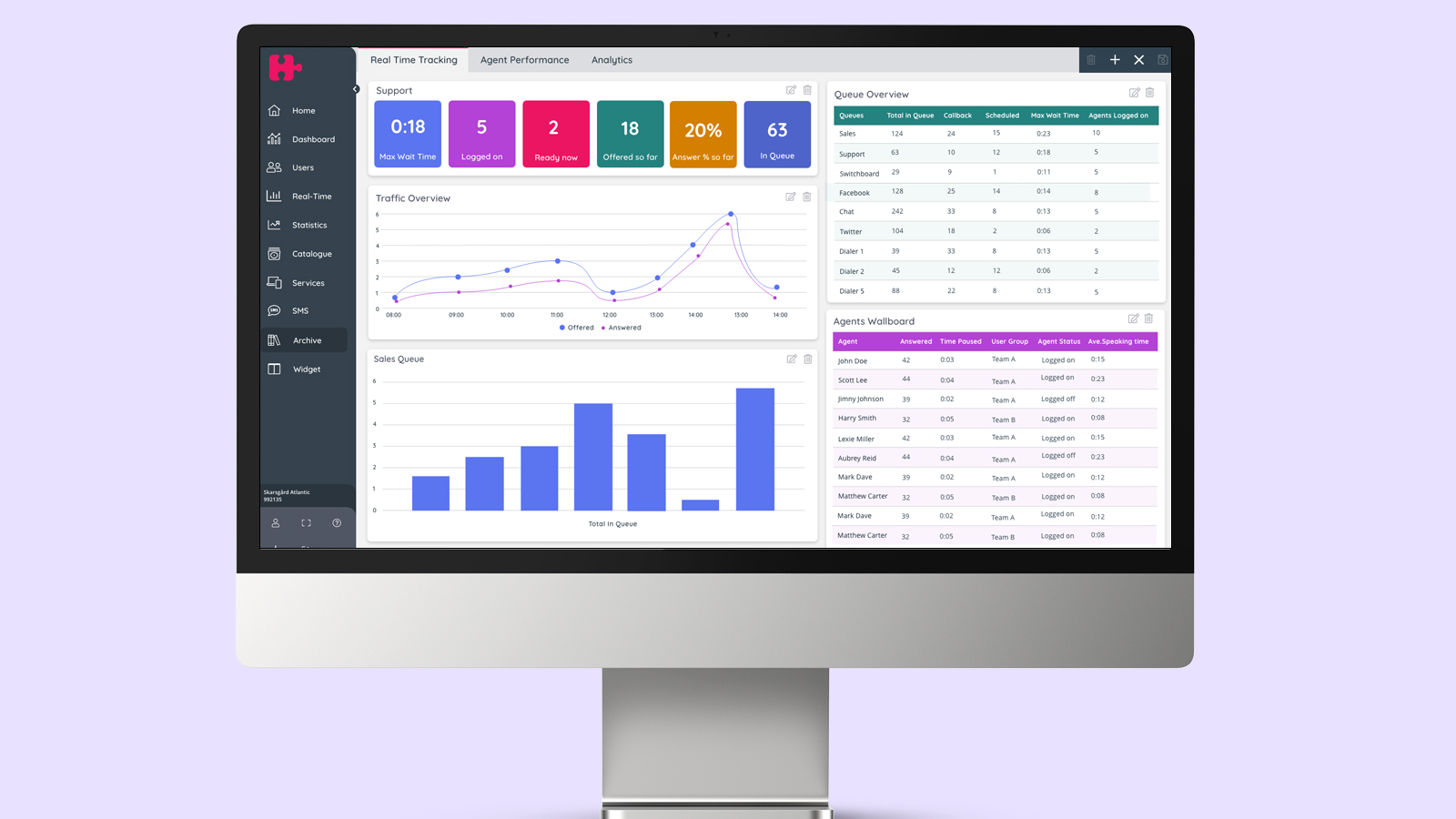
Result
In this release (2022), we’re introduced the Supervisor Dashboard, a tool that visualizes key data from the Admin backend, including metrics on Agents, Queues, and queue-specific traffic data. The dashboard layout is fully customizable, allowing admins to create, modify, and delete layouts as needed. Each dashboard section can be resized and rearranged to provide maximum flexibility and an optimal user experience. For each widget, columns can be selected during creation or added later. Additionally, admins can choose theming options to align with the desired dashboard color scheme.