Anjella De Los Reyes
Senior UI/UX Designer
Optimizing Product Pages for Conversions
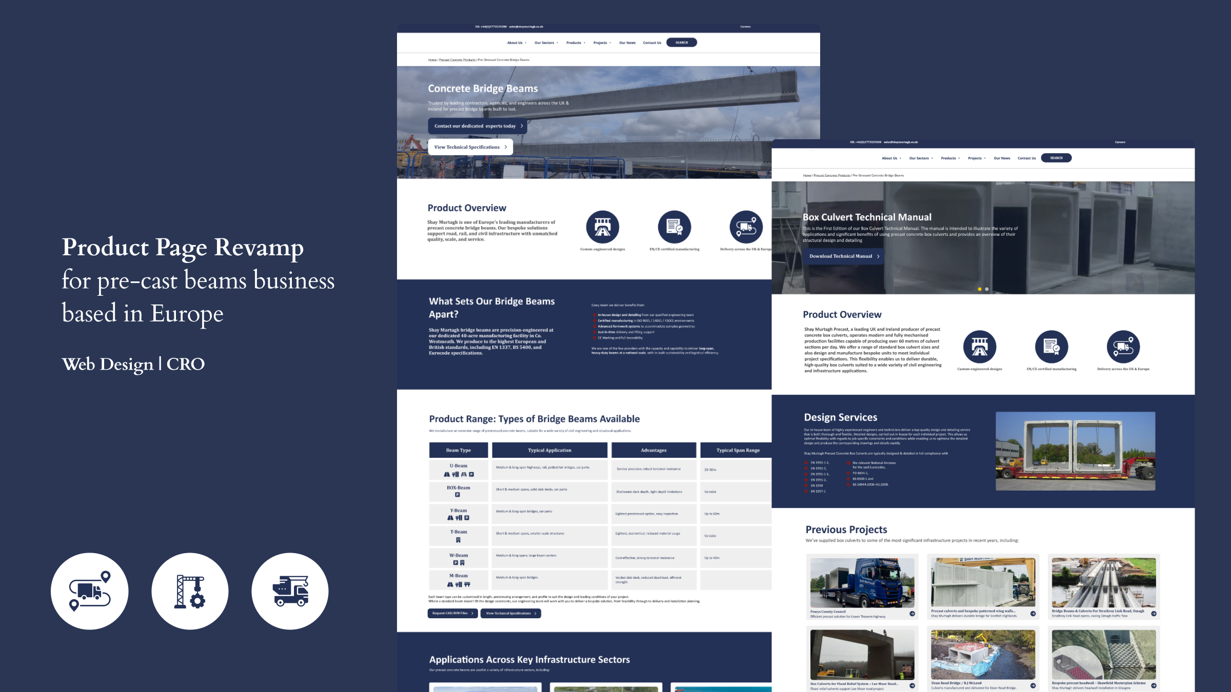
Conversion-Focused Product Page & Component Redesign for European Company
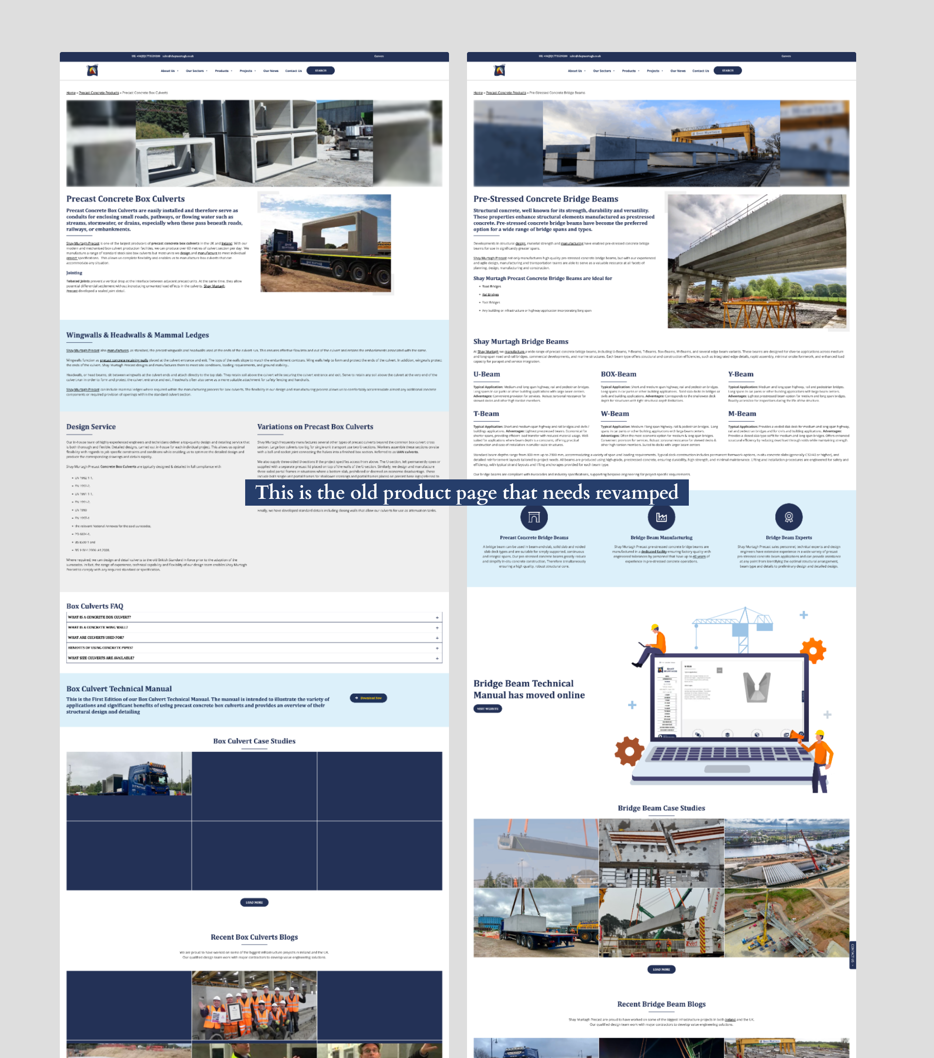
The Challenge
When I first explored the product pages in the website of this precast beams business, one thing was clear: the content was extremely text-heavy. Important information was hidden in long paragraphs, and lack of visual cues to help users understand the products. Because of this, the pages felt overwhelming, hard to scan.
This lack of visuals and intuitive structure made it difficult for potential customers to quickly understand key details—ultimately hurting engagement and conversions.
Here’s the (OLD) current product pages in the website
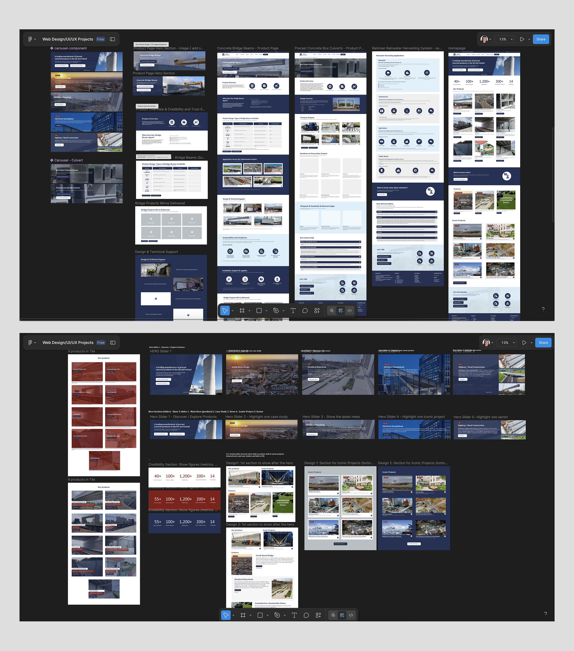
Role
UI/UX Designer — Product Page & Component Redesign, CRO Enhancements
I led the redesign of the product page and key web components, focusing on clarity, usability, visual communication, and conversion optimization.
Here’s the Figma screenshot showcasing the page designs and components I created for the website.
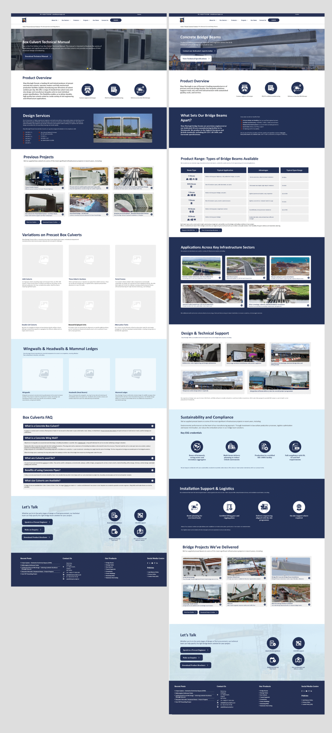
Mockups— More intuitive, visual, and conversion-focused
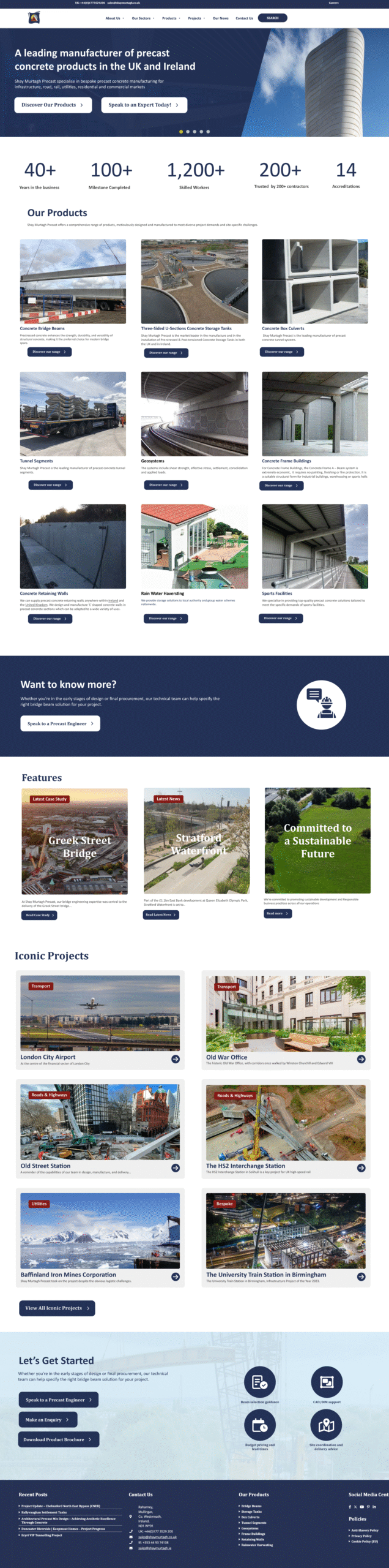
I also find their homepage text heavy and lack of CRO so i revamped their homepage, in case they wanted to update it.
Homepage design
Outcome
The redesigned product page is now clearer, easier to navigate, and much more visually engaging. By adding structured content, relevant images, icons, and improved components, users can quickly understand product details without feeling overwhelmed. The design not only enhances comprehension but also supports better CRO by guiding users toward action more naturally.
The new design was approved and is now ready for development—bringing the business closer to a modern, user-friendly, and high-performing website.